 |
| This is likely to be the final logo for another event I am co-running in huddersfield. there will probably be some more minor changes to give the logo a more distorted feel! Also i may experiment with replacing the speaker shapes that form the two "O's" in the logo with vinyl vectors instead. |


Tuesday, 21 September 2010
Distortion Logo
Random Image Manipulation (Mini Cars)
 |
| These are all examples of a really simple technique I enjoy using on car photography to make them look like mini versions but without making them look squished. Its quite simple really, all you have to do is copy the original wheel arches from the car and paste and blend them onto of a squashed version of the photo. The above is Subaru Impreza WRX STI |
 |
| Lanci Delta Intergrale |
 |
| Ford Gt90 |
 |
| Ferrari F430 Spider |

Scandalous Quick a3 Poster
 |
| Here are two poster designs created for scandalous(colour) using a variety of brushes I created i layered up the background on photoshop and added some vector illustrations of speakers as well as all the relevant information and other logos such as Facebook etc... |
 |
| Same as the poster above but with the DJs/acts in a bigger font size. |
Scandalous Outdoor Posters (printed on luminous poster paper)
 |
| These are a set of poster i designed to go with the rest of the scandalous branding. They are designed to be printed onto a1 luminous poster paper in a black waterproof poster ink for use outside on poster boards in leeds etc. |
 |
| Second of a set of two with the record/vinyl logo placed on the opposite side. |
Scandalous VIP Passes
 |
| These were also created for the event 'scandalous'. They are VIP passes for djs etc. I illustrated the smiley face seen on the logo into a cartoon DJ and placed playful photos of each staff member on the card. |
Scandalous Logo (Beach Party Version)
 |
| Created for a beach themed event. So I decided to replace the with a vector beach ball and a bikini! I was quite pleased with the finished logo, its really colourful and playful. |
Sand Typography
 |
| I created this typeface out of wet sand, the font itself is largely based on Baskerville. |
 |
| For this I was just experimenting with placing the cut out letters. |
Business Card For a Friend
 |
| Above is an illustration I created for a friend who sells insulation. He said he wanted a playful business card design that can be linked to the job he does. So my idea was to create a row of houses with the windows being there eyes(to give life to illustration) wrapped up in a big scarf(insulation). |
 |
| Here is the final business card front with the addition of a cartoon moon and the required information on the business card. |
Scandalous Logo
 |
| Logo designed by myself for an under 18's event in Skipton called 'Scandalous' . I decided to use a quite playful font, i also overlapped the individual letters and replaced the 'O' with a vector of a vinyl logo with a playful smiley face in the centre. |

More Vector Work
 |
| vector based illustration done for uni project. I wanted to show vines/leaves wrapping around the word 'vector' which had to be used within the piece. |
 |
| Similar to the design above but this time I created this as a magazine title(iPad/iPhone magazine) |
Huddersfield Town F.C Mascot Logos (Terry the Terrier)
| These are a few examples of what I created for the htfc brief. The brief was to create a logo for the clubs mascot(Terry the Terrier) to wear on his shirt. It had to use the club colours(blue, white, gold, black and red) and also couldn't be too flashy like an american football logo. It also had to include three stars. So I went for a traditional english shield style logo with a cartoon style twist. I also tried to include traditional yorkshire emblems such as the white rose and characteristics of the surrounding areas e.g 'castle hill'. |
| Same as first design but with different style terrier face. |
| For this and the next design i decided to use a slightly more european shield style and this time with a dog paw instead of face. |
| Same as the above design but using the clubs exact red to colour the paw. |
The Light(Leeds) Bag Design Competition
 |
| These 3 images were created for a competition held by the light for a design to go on there new carrier bags. My idea was to draw a lightbulb with the filament inside spelling the words "the light". I wanted the illustration to have a simple hand drawn look to it and only 1 colour(yellow). To create the piece I first sketched the bulb with fine liner, I then on a separate piece of paper painted the shape of a bulb again. whilst the paint was still runny i blew sections of it outwards to give the effect of shining light. Finally i placed them on layers within photoshop to create the finished illustration. |
 |
| this is the same design but using a handwritten style font on photoshop to replace my own. |
 |
| this is the same as the 2nd design but with the same font as above but joined. |
Children Copy Violent Parents Poster
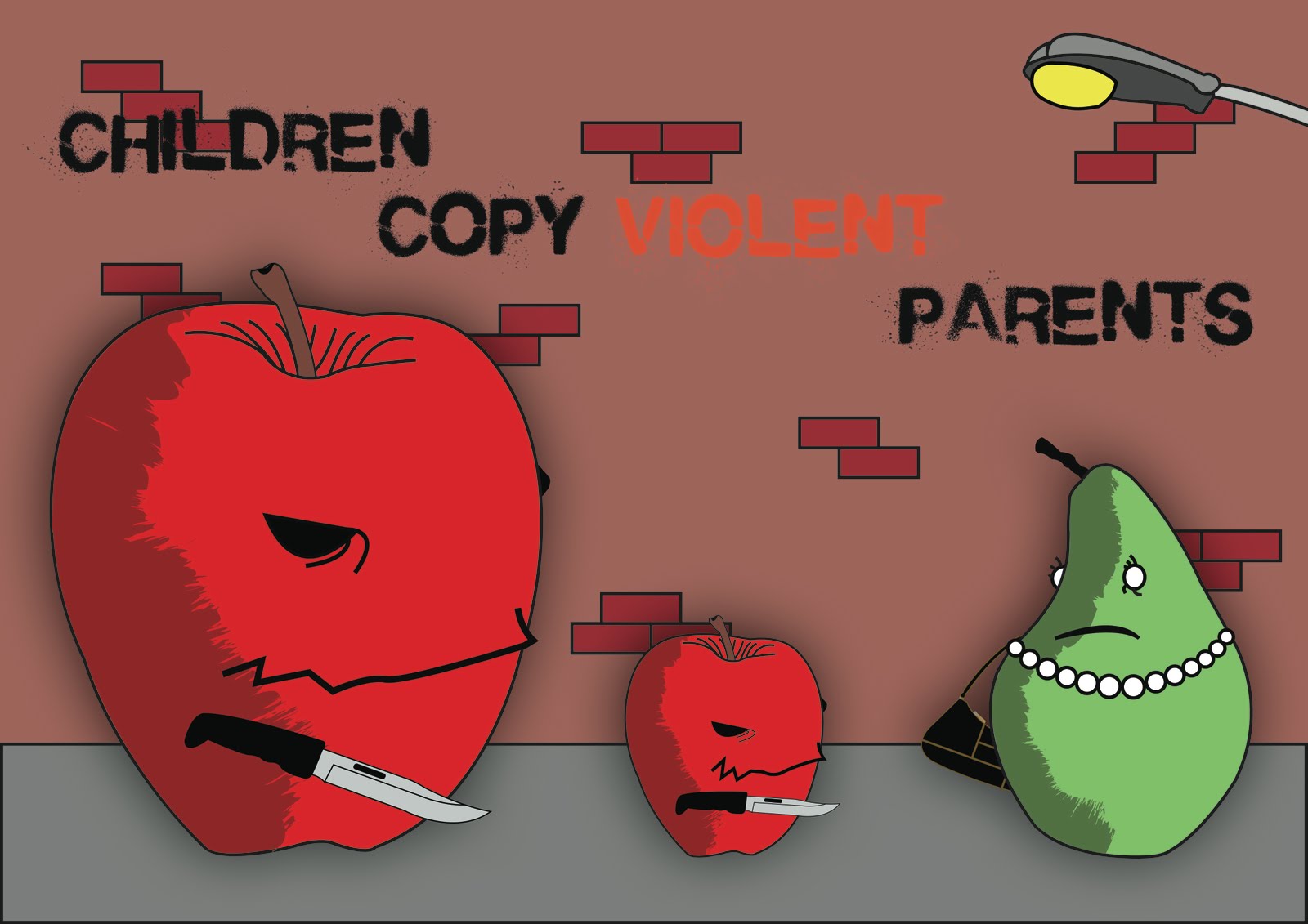 |
| A poster design for a campaign about violent parents influencing there children. I decided to portray the poster with fruit characters as I believe with real characters the poster would not make as much of an impact... |
More Cat illustrations...
 |
| This is a vector illustration I created for a card (either birthday/ fathers day etc) again its an illustration of a friendly cat. I really enjoy creating this style of illustration. |
Random Cat Illustration
 |
| Since I can remember I have always loved cats! above is a simple vector illustration of a fat cat largely based on 'simon's cat' cartoon. I have always found cats behaviour on catnip rather funny so this is my representation in an almost anthropomorphic style. |
Lemon n Lime Poster Design Idea
 |
| simplistic poster idea to go with the other simplistic branding. The idea is that this form of advertising is to the point and there is no unnecessary extra crap... These would be printed on a1/a2 luminous poster paper in black waterproof poster ink (would probably have to be printed on an offset printer) |
lemonnlime.com Website Screen shots
 |
| Home Page (website designed and scripted by myself and Aaron) |
 |
| Design Home Preview Page |
 |
| Design Portfolio |
 |
| Photography Home Preview Page When designing our latest site we really wanted to create a simplistic yet quality feel, although the site is still under construction i believe we are well on the way to achieving that goal. |
Logos Created for my company website
 |
| this is the logo board/set created for my creative company website this summer by me. the name 'lemon n lime' refers to myself(lemon) and my business partner Aaron McConkey(lime). We are a student graphic design/photography team who intend to provide a good quality design service for low budget prices. |
Subscribe to:
Comments (Atom)