 |
| Back of flyer for insight manchester - they wanted something simplistic and effective. |
Monday, 11 April 2011
Thursday, 24 March 2011
Insight:MCR Logo
Friday, 18 February 2011
Wednesday, 16 February 2011
Some random photos Ive taken For the hell of it
 |
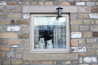
| My cat 'sid' about to pounce! |
 |
| I love my chopper bike, here i have shined my laser on the bike and using a slow shutter speed and minimal light (besides laser) i achieved the above result. |
 |
| James strolling in the woods near my flat in huds. |
 |
| Again playing around with the laser, this time in my basement. |
Monday, 7 February 2011
Sunday, 12 December 2010
Friday, 29 October 2010
Britain Exploring Diversity Brief
 |
| One of the finals produced for brief. |
 |
| same as the other text based final, I tried to replicate the form of the uk and its counties in type. |
 |
| Following the same concept as the other designs but this time I have created the uk shape out of gents toilet symbols in different colours to represent the different races we have in the uk. |
 |
| again the same concept but this time using some of the different religious symbols. |
 |
| again the same but this time I tried representing diversity with different coloured beach huts. |
 |
| this was just an extra design for a bit of fun using the famous phone box to make the shape of the uk. |
Subscribe to:
Posts (Atom)


